


EventVue - A comprehensive website rethinking how we plan personal events.
Eventvue
Mobile website
In this case study:
Competitor analysis
Primary interviews
Affinity mapping
Personas
Storyboarding
Site mapping
User flows and task flows
Wireframing
User testing
Role: UX researcher, UI designer, UX designer
Overview
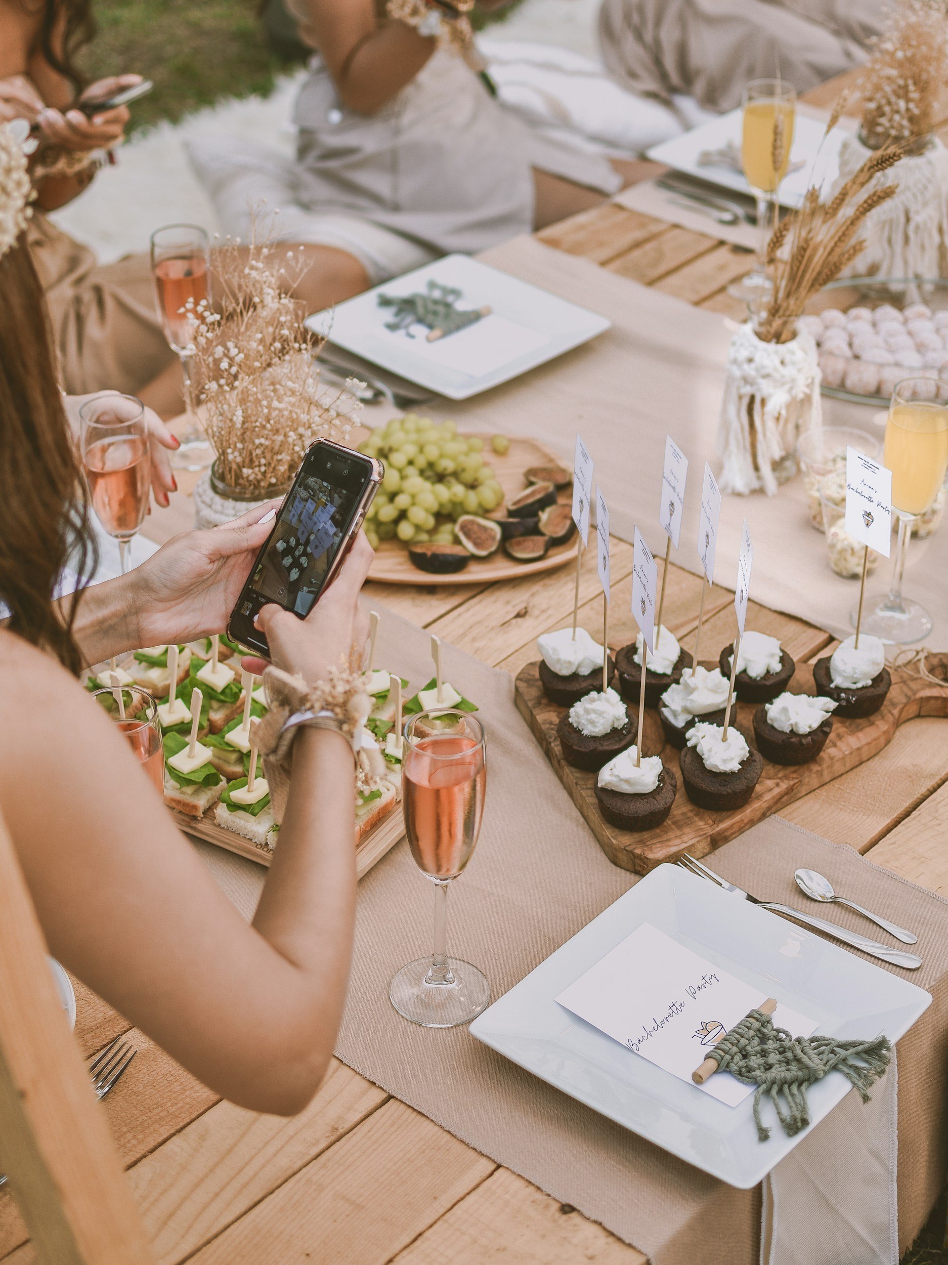
Planning personal events requires multiple steps and communication with various vendors. It can cut costs to do so yourself rather than hiring a professional event planner, but it can also be overwhelming to start and keep things on track. Whether out of a sense of obligation or emotional investment, people are opting to plan their own celebrations to highlight personal achievements and life milestones. This is the mindset behind our user goals and why I have an interest in a product that will simplify this process to reduce stress and support the success of an event.
Research
For a primary perspective, I held interviews, where my communication skills developed through experience with community outreach led to in-depth conversations. To ensure a comprehensive understanding of what currently exists for amateur event planners, I also conducted a competitive analysis
Interviews: Participants who had planned a personal event within the past year were found through online posts and personal connections. I interviewed each individually, asking to share their experience, challenges, methods, and feelings about planning their event.
Competitive Analysis: I researched websites of professional event planners and signed up for event planning sites to get insight on the user process, comparing and analyzing what features were offered and overall service.


What People Are Saying
“Budget was a point of conflict…During winter when we found out about the money issue, the president thought of reducing the event to something small. I started laughing because I already put in so much thought and work in.”
“The event was going to happen, and we were going to try our best to make it a great experience for our daughter… but it was a lingering stressor.”
“Because it’s the city, the prices are inflated so it was a challenge to find something of great quality without breaking the bank. So it was a challenge like picking and choosing where we want to cut costs or if we want to.”
A need for organization and confidence
People valued visualization to assist them in organization.
People were unfamiliar with the event planning space and sought familiarity. They didn’t have a reference point for what are “good choices.”
People were making decisions based off of budget restrictions, which conflicted with the shared user goal to be creating a memorable experience for their guest of honor.
People felt a lack of confidence and distanced from their goal when their decisions were dictated by budget instead of what best fit their desires.
Defining personas and pathways
My process was iterative with limitations. While I did not have the time and resources to conduct tests at each stage, I was able to consult other UX designers, software developers, and my peers for their insights. With their feedback, I could check the learnability and relevance of my design and the deliverables leading to it.


To ensure in each step that I kept the user in mind, I have two personas created from the findings garnered in the interviews.
Focusing on their objectives, motivations, and likely behaviors, I could then create a site map catered to the user’s goals. Its organization and the flows were mapped out accordingly.


Stepping up visualization
UI and branding

While creating the UI components, I was careful to incorporate Eventvue’s brand values throughout. For instance, the color palette was chosen to resonate with both the confident event planners and the apprehensive novices, ensuring inclusivity without compromising on style. I wanted to ensure a branding strategy that adds to the welcoming atmosphere where every user feels empowered.
Brand values: convenient, straightforward, celebratory, bright, inviting
These are the brand values my design focused on emphasizing. Each UI design deliverable was intentionally developed to fit the user goal to conveniently and easily plan a worthy celebration.
-
![]()
Icons
-
![]()
Typography
-
![]()
Logo
-
![]()
Color Palette


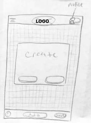
Wireframes and testing
Problem: People are making decisions based off of budget, making them less confident their event will match their desires.
Solution: EventVue incorporates a 3D virtual walkthrough experience. As users select and plan their venues, they can add it to their 3D design to visualize their event and build that missing confidence.
Iterations: The call to action in the hero banner was changed from signing up for a premium account to starting to create a 3D design, ensuring that the hero feature was celebrated


Problem: users felt overwhelmed when needing to understand what vendors to include for their event and to explore multiple sources for each vendor.
Solution: The site allows users to explore featured vendors for multiple services, which links to the 3D design model so they may visualize each before requesting a quote.
Iterations: The design initially included a separate page that showcased all resources which users could swipe through and select what to research further. User test participants had difficulty navigating through this section. When re-evaluating the site map and overall navigation, I decided to remove the overall resources page and instead incorporate a menu tree so that all pages were visible and easily accessible


Problem: users lack confidence in vendors and other design choices they make.
Solution: A 3D virtual walkthrough allows users to build out a model of their planned event before making financial commitments to any vendors, decorations, etc.
Iterations: The upper navigation bar was removed to better use limited retail space, especially when trying to create a model in mobile. Text for buttons and design tab icons were refined to increase learnability.


So did it work?
After creating a high-fidelity prototype, usability tests were conducted to determine the efficacy of the product and any user insights about my proposed solution. Participants were tested with the following goals:
Create an account
Request a quote for a venue
Save an event design created using the modeler tool
What I learned
Hero banner design: The hero banner fulfilled its intended function and drew users toward the CTA. For many users, “Create Your Free Event” was the first button they pressed — Move forward with no actions at this time
Menu labels: “Resources” as a label for pages venues, catering, etc. did not connect for users — Iterated to state “Vendors” instead and include an accordion function so users know what is found in each page
Event Modeler function: Almost every user skipped the option to watch a tutorial, and promptly expressed confusion when viewing the blank modeler tool. Some had clicked on the hero banner without realizing the purpose of the tool, leading to confusion, while others were more confused by the toolbar mechanic — Iterated to include labels for toolbar icons and plans for a brief and automatic tutorial that must be clicked through before using the tool.