


Community Reports.
Enhance your bus journey with community reports—minimize uncertainty and boost awareness for fellow riders awaiting their bus.
OneBusAway
Added feature
In this case study:
Competitor analysis
Primary interviews
Personas
Storyboarding
Site map
User flows and task flows
Wireframing
User testing
Role: UX researcher, UX designer

Overview
One Bus Away is a suite of open source transit information tools that enable transit agencies to provide real-time vehicle locations, alerts, and arrival times. It has widespread use amongst commuters, including myself, and was designed to improve the transit experience.
Despite this, trip-planning reliability is undoubtedly a frustration amongst users. While the app of course, cannot control whether buses come late, there is still a lack of control knowing the context for delays and the accuracy of information. This led to my desire to design a feature that creates more certainty to help users plan their day.
Research
In my research, my goal was to better understand how bus schedules and delays impact commuters so that we can understand what their needs are for trip planning and in a bus tracking app.
Competitive Analysis: I researched other bus tracking apps offered within my local transit system for direct competitors and those for other geographic locations to understand what were the shared features in a bus tracking app, the process to navigate the app, and what could be missing.
I conducted a second competitive analysis after my interviews provided more insight to the direction I should take my design. My analysis focused more on the competitor apps that interviewees named and apps which had similar functionality to the solution I designed.
Interviews: I interviewed 5 participants on their experience with commuting in general, with OneBusAway, and any competitor apps they may use. The interviews provided insights toward what attracted people to an app and what they expected.
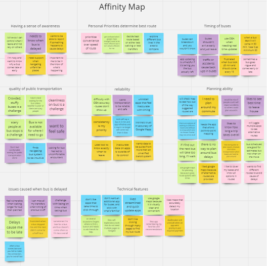
Key Insights
People are overall frustrated by inaccurate bus timing, whether early or delayed, but they understood that these sudden schedule changes were caused by factors beyond anyone’s control.
People want tools that are convenient, familiar, and all-inclusive of their trip-planning needs.
Having a map to manually find routes and bus stops is an expectation for commuters.
People wanted a sense of awareness of their surrounding area including alternative bus routes and solutions to potential issues.
What People Are Saying
“When timing is off you have to wait for the bus a lot longer which adds to feeling unsafe. You’re vulnerable standing there waiting longer than you planned, and you did everything right by trying to track on the app. It’s frustrating when the apps update and suddenly the timing is very different, but I suppose that’s what makes it a live update.”
- Interviewee #1
“I like efficiency and to cover my bases. I like seeing what my options are. [Competitor 1] makes me transfer more while [Competitor 2] gives me one but a longer walk. I like having options.”
- Interviewee #4
“Consistency is my priority. I need to plan around something but with bus, it could take minimum 30 minutes but maybe take more… It’s nice to know that it’s late so you don’t wait for nothing, but the app can’t control the bus. It doesn’t not change how frustrating the transport system.”
- Interviewee #2
Planning the journey
To organize the findings of my research, I created a persona to represent the goals, wants, and concerns expressed by users of the app. This helped to identify how the project overlapped user goals with business goals, and allowed me to brainstorm potential solutions.
The insights defined by my research showed how while inaccurate bus data was a frustration, there were other ways to approach the user’s frustration. They did not simply need the bus to arrive on time or for the app to know exactly when the bus would arrive.
Commuters have difficulty when they do not have all the information available to plan around sudden schedule changes, and want to have a sense of awareness of their surroundings.
Design
With the problem clearly defined, I wanted to ensure that the design created not only match the branding’s style, but also its flow. I drafted a site map for the original design to determine how the new feature would fit in. I also mapped the user flow to determine what key pages needed to be developed as a user goes through alternative paths while interacting with the feature.
Problem: I initially approached the subject believing that inaccurate bus updates would be the most important issue for users.
Instead, I uncovered how commuters want to have all context and options available when planning their commute, but have difficulty trip planning from the lack of reliable and regular bus tracking updates.
Solution: Community reports is a feature that creates more transparent communication by allowing other riders along your route to provide live updates, from extended bus delays to traffic accidents. This provides you the information and power to plan around sudden bus route changes.
Developing the Flow
A key element I wanted to design for this feature was a notification for users when they search the schedule of a specific route that has had many incoming reports. The intent was to act as a preliminary warning and users could decide if they wanted to change routes rather than wait an unknown period of time.
Iteration: Users found the initial notification design to be large and intrusive. The size was reduced in later iterations and then moved toward the bottom of the screen to provide users more control in whether they engaged without eliminating its purpose as a notification.
A key flow to design was how users would file a report. With the goal of convenience in mind, I initially designed a single-page form, divided by schedule delays and traffic incidents.
Iteration: Users wanted confirmation as they went along the form. This indicated the need for a multi-page format and created a smoother flow of steps to complete a form.
Take it for a ride
Testing was conducted twice in the prototyping phase, first for the low fidelity wireframes, and then with the high fidelity version. Users were tested on the following tasks:
File a community report
View what others have reported for a specific bus route

What did we learn
Multiple choice questions: Participants appreciated the ease of selecting their issue in the form and that various scenarios were included so that they did not have to write up an issue and could select an option. This made the report filing process faster and requiring minimal effort to learn — Move forward with adding a few additional options.
View more reports: Participants were able to easily access this feature and appreciated the validation of seeing how many other reports were submitted and when. Participants expressed that this provided the spatial context that they were looking for — Move forward with no further actions at this time.
Language: Language surrounding the form led to confusion in some participants as they were unclear the purpose of the feature.
Iteration: Adjusted language to match user expectations and patterns from competitors.
Form layout: Almost every participant went to click on “add another issue” while verbally expressing confusion over why they should add more despite not having another issue to report. This implied confusion over what elements of the form are necessary and that the format needs to change.
Iteration: changed multi-page form, with the option to file another report at the end.
Future opportunities
This case study showcases my approach toward adding a feature to an existing app and matching a company’s established branding. Given the opportunity to spend more time and budget on this project, I would also incorporate these visual indicators of reports to the map, another element many interviewees identified as something they regularly referenced.
Next steps: Conduct a card sort to affirm the chosen language matches user expectations and simplifies navigation. Run another round of user testing to analyze form layout changes.